Kim and Jordan elected to have our monogram tag booklets with ribbon for their wedding programs. They chose a recycled navy blue cardstock (matte) as the cover, and white matte inner layer for the program base. The outer tag was made of white matte cardstock and was designed to coordinate with the design on their wedding invitation, including the touch of pink! The inside of the program included an introduction for the event, their wedding party, and ceremony order-- all printed in navy blue.
they also ordered 2 layer folded place cards. The back layer was made of metallic navy blue paper, and the top layer was made with white matte cardstock. again, we carried the dot/line design to the add the perfect amount of details to the cards.
Matching table numbers and a guest book sign, although not pictured, were also created with the blue/white paper combo and navy/light pink delicate design.
congrats to the bride and groom!!!!
Monday, May 30, 2011
Friday, May 27, 2011
Katie and Rob circle cut out wedding "programs"
Katie and Rob are having a wedding weekend in New Jersey, so they wanted a little booklet to keep the guests informed throughout their stay. The chose to use our circle cut out wedding programs!
The cover was a gold metallic paper with a large circle cut out to showcase the couple's names. The inner layers, printed on white matte papers, included various information for the guests. Included: an introduction to the weekend, the event schedule for the entire weekend, drink vouchers for their welcome party, places and things to do, and a page for important phone numbers and addresses. a dusty rose lace holds the pages together.
Two different books were created- the bridal party will have a different (more detailed/more events) schedule than the remainder of the guests.
congrats to the bride and groom!
Leslie and Adam modern 4 layer programs
looking through my photos... I realized i never posted these photos! oops!
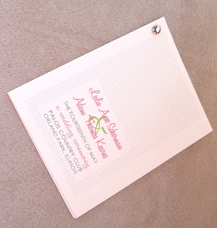
Leslie and Adam chose to use our modern 4 layer programs for their wedding. the first page included their names, wedding date and ceremony location. The following pages include the ceremony order, the wedding participates, and a special note to their wedding guests (thank you and in memory sections).
Our popular dot design was used throughout the program. the fonts coordinated with other paper products from their wedding.
congrats to the (now) married couple! best of luck to you both!
Ashton and Mike three panel fans
Ashton and Mike loved our three panel fans. Ashton asked that the design of their programs match their wedding cake: a blue line with dots down both sides--- so using a cream cardstock as the base, the wording color matched the design down the side, as well as the blue ribbon color. i love it when things come together!
congrats to the happy couple!
congrats to the happy couple!
Monday, May 23, 2011
Jennifer and John- coordinating wedding items
Jennifer and John picked a variety of our items to coordinate with their wedding!
Menus: Ruby metallic cardstock is the sturdy base to the menu. the light purple metallic paper showcased the dinner menu in ruby and black colored inks.
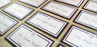
Escort Cards: to tell the wedding guests what table they will be sitting at, 2 layer flat escort cards were created. A metallic ruby cardstock is the sturdy base to the cards. the light purple metallic paper showcased the guests name in black, surrounded by a Ruby colored border and grape motif. a location for table numbers was also printed on the bottom of the card for the couple to fill in the number when table numbers are finalized.
Table Numbers: double sided table numbers were created to match the colors and fonts of all of the other items. A ruby cardstock base was cut to 4x6" in size. the table number was printed on light purple paper with ruby colored ink. each side of the card includes the table number so guests can find their table from any direction.
Place Cards: once they know what table they will be sitting at, the wedding guests will be able to find their seat using the 2 layer folded (tent style) place cards. again, using Ruby as the base and light purple metallic papers as the top layer, the guests' names are printed in black, surrounded by a Ruby colored border and grape motif.
Mini Scrolls: instead of favors, the couple elected to make a donation to a charity. to tell the guests this, they elected for mini scrolls. each 4x6" scroll is printed on light purple metallic paper and includes a Ruby colored border as well as black/ruby colored fonts. A bright purple ribbon is also included so the papers can be rolled/held in the "scroll" shape.
A beautifully coordinated wedding- i am very thrilled to have such a large part of the details sprinkled throughout their day.
Congrats to the bride and groom!
Menus: Ruby metallic cardstock is the sturdy base to the menu. the light purple metallic paper showcased the dinner menu in ruby and black colored inks.
Escort Cards: to tell the wedding guests what table they will be sitting at, 2 layer flat escort cards were created. A metallic ruby cardstock is the sturdy base to the cards. the light purple metallic paper showcased the guests name in black, surrounded by a Ruby colored border and grape motif. a location for table numbers was also printed on the bottom of the card for the couple to fill in the number when table numbers are finalized.
Table Numbers: double sided table numbers were created to match the colors and fonts of all of the other items. A ruby cardstock base was cut to 4x6" in size. the table number was printed on light purple paper with ruby colored ink. each side of the card includes the table number so guests can find their table from any direction.
Place Cards: once they know what table they will be sitting at, the wedding guests will be able to find their seat using the 2 layer folded (tent style) place cards. again, using Ruby as the base and light purple metallic papers as the top layer, the guests' names are printed in black, surrounded by a Ruby colored border and grape motif.
Mini Scrolls: instead of favors, the couple elected to make a donation to a charity. to tell the guests this, they elected for mini scrolls. each 4x6" scroll is printed on light purple metallic paper and includes a Ruby colored border as well as black/ruby colored fonts. A bright purple ribbon is also included so the papers can be rolled/held in the "scroll" shape.
Programs: they choose our booklets with monogram tag and ribbon closure. we used Ruby metallic paper as the cover and light purple metallic paper as the inner layer and outer tag. A "watermark" of grapes is showcased behind the couple's names/wedding date on the outer tag. All fonts are printed in a ruby color ink to match the dark purple cover. An ivory ribbon was used as the final touch to hold the pages together.
A beautifully coordinated wedding- i am very thrilled to have such a large part of the details sprinkled throughout their day.
Congrats to the bride and groom!
Michael and Alicia pearlescent wedding program fans
Michael and Alicia elected to use our pearlescent fan programs as part of their wedding ceremony. Using Old gold cardstock as the back layer, their Hawaiian poems (with the English translation) were printed in black in on a champagne top layer. Their names and wedding date were engraved on the base of the wooden handle. an ivory ribbon was also tied into a small bow as the final detail of the program.
Congrats to the happy couple!
Congrats to the happy couple!
Tuesday, May 17, 2011
Yesenia and Efrain's wedding table "numbers"


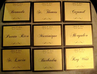
Yesenia and Efrain are planning their 10th anniversary celebration and asked us to create table "numbers" for the event. A bronze (dark brown) metallic cardstock was used as the tented (folded) base, and a gold metallic paper was used as the top layer. their names, event title, swirl graphic and location (the table "number") was printed in brown ink.
Congrats to the couple on their accomplishment!
Toni Sue and Travis's Layered Wedding Programs


Toni Sue and Travis are getting married in Hawaii (yes, i'm jealous). We used fuchsia starfish and titles as well as a satin ribbon to keep the color in the programs, without making it overwhelming.
The loved our three panel layered wedding program, but needed some more writing space-- so we just added another layer!
Using metallic white paper, the front cover showcased an introduction to the event, including their names, wedding date, and location.
the second layer included their wedding party, while the third layer stated the ceremony order. The last page showcased a very touching and heartfelt thank you to those guests who traveled to be with the couple on their special day... and dont forget the starfish accents on each page!
congrats to the bride and groom!
Sunday, May 15, 2011
Program Wrap closures for Jessica and Jonathan
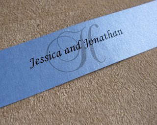

Jessica and Jonathan already had their wedding programs... but they loved the "final touch" used on our three panel programs: the wrap closure. I was more than thrilled to create their custom wraps for their programs.
Using Vista Blue metallic papers, their monogram initial and names were printed in the center of the 1" strip. A double sided peel-'n-stick adhesive was attached to one end of the wrap closure for easy assembly.
Congrats to the bride and groom! I'd love to see photos of the final product!
Tuesday, May 10, 2011
Katia and Jay's wedding invitation set


I "met" Katia through a referral, and was so pleased when i was able to help the happy couple with their wedding invite set. Katia and Jay loved the more laid back invitations, but they still wanted something classy too-- and i think we did just that!
Using a few boxes of store-bought invites, some cardstock, and some craftiness, we were able to dress up some otherwise "main-stream" wedding invites. The store bought invites included the pocketfolder, invite and RSVP paper, envelopes, and twine/tie.
The tree/bird graphic was already printed on the invitation layer-- so we matched the brown ink of the wording to the brown color of the tree. A casual-but-not-to-casual font was used through out the invite set to keep with the theme of their classy- laid back wedding.
Using the purchased items as the base to their invite, we added a layer of Bronze (dark brown) metallic cardstock behind the invite layer. this added not only some weight to the invite (to feel more substantial), but it added a beautiful hint of color as well. it also separated the invite layer from the pocketfolder, as they are made from the same textured cream papers.
The RSVP card, also made from the textured cream paper, already had the blue birds on the top, so we added the wording underneath the graphics. to add some more weight to the RSVP cards, we cut down the cards and then matted them to an Old Gold metallic cardstock base.
The couple's address was printed on the front of the RSVP envelopes with matching font/color to the rest of the invite set.
On the front of the pocketfolder, a branch graphic was printed on the lower right side. Two bird punch outs are sitting on the bench. When the invite set is assembled, the teal RSVP envelope shows through the folder to make the birds the matching teal color. (i cannot take credit for that, but i loved that detail!)
The outer envelope included the bird graphic printed on the back flap. I also included printed labels for easy mailing-- the labels are long enough so that they can be folded around the envelope: the couple's return address is printed on the left side of the label ( it will be placed on the back of the envelope) and the guests' names and address was printed on the left side of the label ( so it will be on the front of the envelope).
Overall, these turned out lovely-- and it's a great way to jazz up some store bought items to make them your own.
congrats to the bride and groom to be!
Tuesday, May 3, 2011
Tosh and Douglas' wedding invitation suite
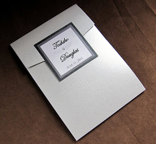


I had the honor of creating a wedding invitation suite for Tosh and Douglas. They had great ideas-- and together we created this amazing product.
A metallic silver envelope will arrive at their guest's residences. The envelope included the printing of the guests' names and addresses in matching invitation fonts on the front of the enevlopes. The bride and groom-to-be's names and return address were printed on the back flap.
When the cascade pocketfolder, the base for the invitation, is pulled out of the envelope- their guests will see a two layer outer tag with the couple's names and wedding date printed on the white top layer. A single clear rhinestone was placed in the center of the swirl graphic.
With the pocketfolder opened, their guests will see the invitation itself was printed on a white metallic layer with black ink, and adorned with a 1.5" thick black satin bow holding a double row rhinestone buckle. a black cardstock layer was used as a back layer, highlighting the invitation.
In the pocket, three accessory cards were printed with black printing on white paper, and layered with a black cardstock backing. Each card was tiered to the other two.
The largest card, the direction card, included printed directions on the front side, and a gray scale map on the back side. The middle card was the reception card and gave details on the celebration dinner to follow the ceremony. The smallest card was the RSVP card and included space for the guests to place their names as well as their intentions for the event. A silver metallic envelope was also included for the guests to mail the RSVP card back to the happy couple. The envelope included the printing of the couple's names and return address in matching invitation fonts.
An amazing and classy invitation, sure to turn heads and be the "talk of the town" for years to come.
Congrats to the bride and groom to be!
Sunday, May 1, 2011
Kelly and Drew's tea length programs


Kelly and Drew loved our tea length wedding programs. Using Ivory cardstock and navy blue/bright pink font, their introduction was printed on the top of the page while the order of the wedding ceremony was printed on the bottom of the program. the back of the program showcases their wedding party and a thank you. Navy colored swirl graphics are printed throughout the program. a bright pink ribbon on the corner of the program is the final detail.
Congrats to the bride and groom!!!
Marilyn and Jonathan's program booklets


Marilyn and Jonathan elected to use our booklet programs with monogram tag for their wedding programs. They chose a light purple metallic color for the cover and a champagne (metallic) paper for the insert layer and tag. An ivory ribbon tied the two layers together along the left side of the program.
The outer tag includes a printed green border, along with their names, wedding date, and ceremony location.
For the insert layer of the program: the first page includes an introduction of the wedding, including full names of the couple as well as ceremony details (time and location). The middle two pages showcase their wedding party and the order of the wedding ceremony. The back page includes a thank you note to their guests and a special tribute to those who could not attend the ceremony.
best of luck to the happy couple! Congrats!
Subscribe to:
Comments (Atom)


